파이썬/시각화 matplot
pyplot으로 서브플롯 그리기 plt.pyplot
Merware
2023. 5. 15. 16:15
[학습목표]
pyplot 메소드로 하나의 실행창에 여러 그래프를 그려 비교할 수 있다.
- 앤스콤 4분할 그래프
영국의 프랭크 앤스콤(Frank Anscombe)이 데이터를 시각화하지 않고 수치만 확인할 때 발생할 수 있는 함정을 보여주기 위해 만든 그래프
import matplotlib.pyplot as plt
데이터 불러오기
- seaborn 라이브러리에서 제공하는 anscombe 데이터 사용
import seaborn as sns
anscombe = sns.load_dataset('anscombe')
anscombe.head()

"""
	dataset	x	y
0	I	10.0	8.04
1	I	8.0	6.95
2	I	13.0	7.58
3	I	9.0	8.81
4	I	11.0	8.33
- 4가지 데이터를 각각의 데이터프레임으로 만들기
df1 = anscombe[anscombe['dataset']=='I']
df2 = anscombe[anscombe['dataset']=='II']
df3 = anscombe[anscombe['dataset']=='III']
df4 = anscombe[anscombe['dataset']=='IV']
- 데이터 확인하기
print('==== df1.head(2) ====\n'  , df1.head(2))
print('\n==== df2.head(2) ====\n', df2.head(2))
print('\n==== df3.head(2) ====\n', df3.head(2))
print('\n==== df4.head(2) ====\n', df4.head(2))

"""
==== df1.head(2) ====
   dataset     x     y
0       I  10.0  8.04
1       I   8.0  6.95

==== df2.head(2) ====
    dataset     x     y
11      II  10.0  9.14
12      II   8.0  8.14

==== df3.head(2) ====
    dataset     x     y
22     III  10.0  7.46
23     III   8.0  6.77

==== df4.head(2) ====
    dataset    x     y
33      IV  8.0  6.58
34      IV  8.0  5.76
print('==== df1.shape ====\n' , df1.shape)
print('\n==== df2.shape ====\n', df2.shape)
print('\n==== df3.shape ====\n', df3.shape)
print('\n==== df4.shape ====\n', df4.shape)
"""
==== df1.shape ====
(11, 3)
==== df2.shape ====
(11, 3)
==== df3.shape ====
(11, 3)
==== df4.shape ====
(11, 3)
데이터의 통계수치 확인
- 데이터프레임.describe()
- 4개의 데이터는 갯수, 평균, 표준편차가 모두 같다.
- 이러한 수치만 보고 4개의 데이터 그룹의 데이터가 모두 같을 것이라고 착각할 수 있다.
df1 = df1.describe()
df1

"""
		x	y
count	11.000000	11.000000
mean	9.000000	7.500909
std	3.316625	2.031568
min	4.000000	4.260000
25%	6.500000	6.315000
50%	9.000000	7.580000
75%	11.500000	8.570000
max	14.000000	10.840000
"""

df2 = df2.describe()
df2
"""
		x	y
count	11.000000	11.000000
mean	9.000000	7.500909
std	3.316625	2.031657
min	4.000000	3.100000
25%	6.500000	6.695000
50%	9.000000	8.140000
75%	11.500000	8.950000
max	14.000000	9.260000
"""

df3 = df3.describe()
df3
"""
		x	y
count	11.000000	11.000000
mean	9.000000	7.500000
std	3.316625	2.030424
min	4.000000	5.390000
25%	6.500000	6.250000
50%	9.000000	7.110000
75%	11.500000	7.980000
max	14.000000	12.740000
"""

df4 = df4.describe()
df4
"""

	x	y
count	11.000000	11.000000
mean	9.000000	7.500909
std	3.316625	2.030579
min	8.000000	5.250000
25%	8.000000	6.170000
50%	8.000000	7.040000
75%	8.000000	8.190000
max	19.000000	12.500000
데이터 시각화
# 첫번째 데이터
plt.plot(df1['x'],df1['y'],'o')
[<matplotlib.lines.Line2D at 0x24fdbf39dc0>]
# 두번째 데이터
plt.plot(df2['x'],df2['y'],'o')
[<matplotlib.lines.Line2D at 0x24fdcdb8e80>]
# 세번째 데이터
plt.plot(df3['x'],df3['y'],'o')
[<matplotlib.lines.Line2D at 0x24fdce20af0>]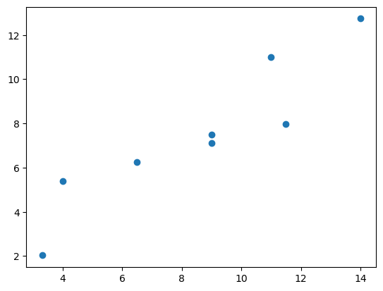
# 네번째 데이터
plt.plot(df4['x'],df4['y'],'o')
[<matplotlib.lines.Line2D at 0x24fdce8b850>]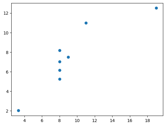
# 4개의 그래프 한번에 그리기
plt.plot(df1['x'],df1['y'],'o')
plt.plot(df2['x'],df2['y'],'o')
plt.plot(df3['x'],df3['y'],'o')
plt.plot(df4['x'],df4['y'],'o')
[<matplotlib.lines.Line2D at 0x24fdd613ee0>]
서브플롯 그리기
1) 전체 그래프의 크기를 정한다. (정하지 않으면 디폴트 크기로 지정된다.)
plt.figure(figsize=(x사이즈, y사이즈))
2) 그래프를 그려 넣을 격자를 지정한다.(전체행개수,전체열개수,그래프순서)
plt.subplot(전체행개수,전체열개수,그래프순서
3) 격자에 그래프를 하나씩 추가한다.
plt.figure(figsize=(9,6))
plt.subplot(221)
plt.plot(df1['x'],df1['y'],'o')

plt.subplot(222)
plt.plot(df2['x'],df2['y'],'+')

plt.subplot(223)
plt.plot(df3['x'],df3['y'],'*')

plt.subplot(224)
plt.plot(df4['x'],df4['y'],'d')
[<matplotlib.lines.Line2D at 0x24fd9cc07f0>]
전체 그래프의 속성 지정
- figure 객체를 변수에 받는다.
- figure객체의 suptitle(제목)메소드로 전체 그래프의 제목을 표시한다.
- figure객체의 tight_layout()메소드로 그래프의 간격, 너비를 최적화한다.
fig = plt.figure(figsize=(9,6), facecolor='ivory')

plt.subplot(221)
plt.plot(df1['x'],df1['y'],'o')
plt.title('ax1')

plt.subplot(222)
plt.plot(df2['x'],df2['y'],'+')
plt.title('ax2')

plt.subplot(223)
plt.plot(df3['x'],df3['y'],'*')
plt.title('ax3')

plt.subplot(224)
plt.plot(df4['x'],df4['y'],'d')
plt.title('ax4')

fig.suptitle('Amscombe', size=20)
fig.tight_layout()